The world as you have never seen it before
A pan-Atlantic alliance between academics at the University of Sheffield and the University of Michigan has created an extraordinary web resource at www.worldmapper.org.
Worldmapper is a collection of world maps where territories have been re-sized according to the distribution of particular variables, such as the prevalence of HIV/AIDs, poverty, war deaths or carbon emissions.
In a normal world map, territories are obviously roughly proportional to their land area. What Worldmapper has done is to create an algorithm that can transform a normal map so that the size of each territory is instead proportionate to its share of the world total of a given variable. The effect is a devastating visual demonstration of the staggering inequalities that still grip our planet.
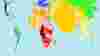
The map above, for example, shows a section of a map detailing the number of all infants (aged under 1) who died in the space of one year according to the World Health Organization's Burden of Disease Estimates, published in 2006. India (in orange) and Africa (in red) suddenly dominate. By comparison Western Europe and the United States have shrivelled to relative insignificance.
There are now nearly 600 maps like this on the Worldmapper site.
The above image is Copyright © 2006 SASI Group (University of Sheffield) and Mark Newman (University of Michigan).
Related Articles
-
 NewsGapminder demonstrates the beauty of statisticsGapminder demonstrates the beauty of statistics
Professor Hans Rosling's lectures have become an internet phenomenon. His website www.gapminder.org makes his incredible visual statistical displays freely available for all to see.
-
 NewsSociety sponsors Season Five of The Charity CEO PodcastSociety sponsors Season Five of The Charity CEO Podcast
 -
 NewsWeb 2.0 harnesses the power of naggingWeb 2.0 harnesses the power of nagging
A social networking site called www.thenag.net is trying to mobilise people towards sustainable living.
-
 NewsTED talk highlights the vital importance of leadershipTED talk highlights the vital importance of leadership
In one of the many inspiring talks available at www.ted.com, Patrick Awuah speaks about the need for a new generation of enlightened leadership in Africa.